When it comes to the current state of the Cannabis industry, there is no debate that product packaging plays a large role in the aspect of marketing. The same can be said for the many heady beers hitting shelves on a regular basis. But in a world where an eye-catching package can distract from the actual quality of the product it holds, or a dull design may not adequately represent the product’s high quality – a watchful eye can make all the difference.
The colors employed in a company’s marketing have a significant influence on how people will perceive a product, and can ultimately affect whether or not they buy it or recommend it to others. And given the many Cannabis companies flexing on their Instagram pages, the visually appealing packaging provides the opportunity to spread awareness of their brand and increase the bag appeal of their product. Keep in mind: There is no industry standard for how far companies can take this – with different compliance laws in every state limiting artistic design in some cases. We have seen packaging be discontinued around the country due to such issues.
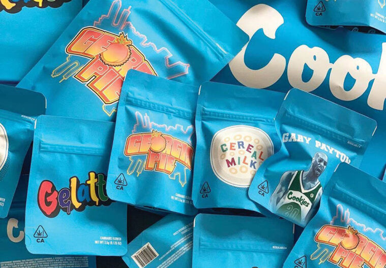
Cookies brand products are a great example of colorful Cannabis packaging that pushes the limit on compliance, while staying within the boundaries. It is pretty rare to find a Cannabis consumer who isn’t familiar with those little blue mylar bags, often adorned with a creative spin on the strain inside. For example, Georgia Pie comes in a bag with a peach-colored text and a peach instead of an “o” in the word Georgia. Or maybe you’ve seen The Soap – with sudsy bubbles spelling out the strain name in an almost robin’s egg blue. In any case, the Cannabis industry should be able to do whatever they want with their packaging and let consumers be the judge on what appeals to them, or doesn’t.
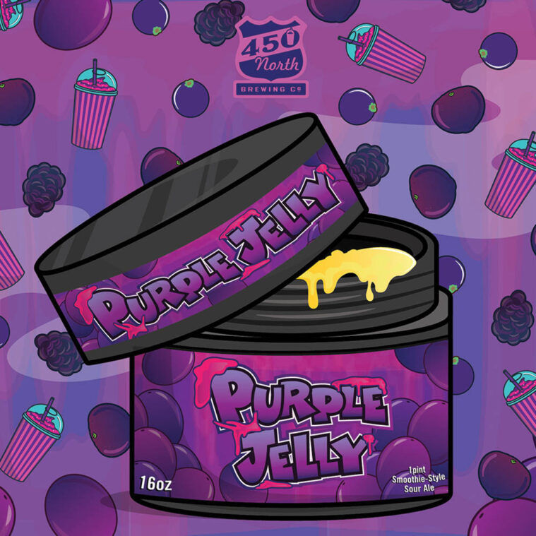
Is beer different? In fact, beer packaging standards are generally much more lenient. There are some areas of crossover, such as potency and manufacturing information (where it was made/grown) needing to be included on the outside labels. But we constantly see double standards like product packaging that can appeal to children being OK for beer companies, but not for Cannabis companies. Many sour beers today are made with copious amounts of fruits and sometimes even candy. I have seen everything from cartoon-style, candy-like fruits, to straight up cartoon images of sweets on the outside of beer cans. I think it goes without saying that this would not fly in certain states’ Cannabis industries. Many people in liquor stores are shopping for a creative label that speaks to them, so why limit Cannabis companies in their creative expressions?
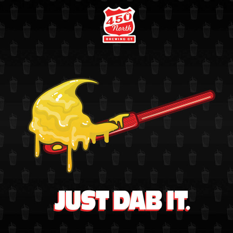
In the beer world, RAR Brewing is among the top dogs – from the quality of their brews to the packaging it comes in. Their “Out of Order” series is a play on the Slush Puppy dog, and they do a series of five to six different smoothie-style sours on every drop. In-house artist BJ Wheatley crafts up their vibrant designs, putting his all into every can. 450 North Brewing is another prime example – with cartoon-like color blasting out of their smoothie cup surrounded by fruit, candy and baked goods on every single can. Many people swear by the fact that these are two of the best beer makers in the world – and the packaging certainly doesn’t hurt in conveying that message to new potential customers.
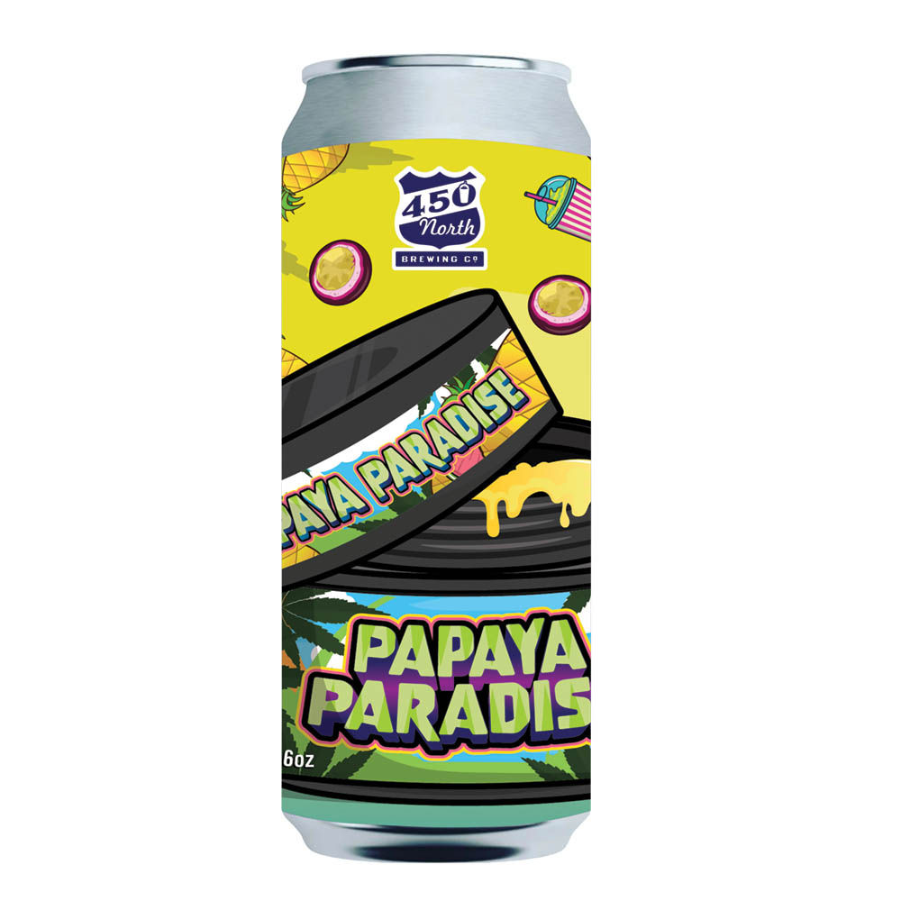
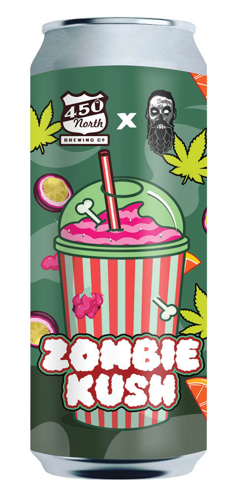
Packaging can surely have its pros and cons, but overall, the community seems drawn to artistic renditions of existing packaging – as long as the product inside backs it up. With the way the markets are changing nationwide, we can definitely expect to see companies expand upon their current designs, for both Cannabis and alcohol industries. And while judging a book by its cover is never a good idea, it’s fair to hope it’s a proper representation of its contents.


